Nothing introduced the Nothing Phone (2) earlier this month. The device is the follow-up to the very unique Phone (1) launched last year. The next-generation smartphone arrived with quite a lot of improvements in its hardware while keeping a pretty similar design to its predecessor.
From a larger LTPO OLED panel and a slightly larger 4700mAh battery to an improved Sony IMX890 main sensor and the Snapdragon 8+ Gen 1 chipset, it looked like the Nothing Phone (2) was a massive step up from its predecessor. This also came with an increase in price tag though compared to the Phone (1).
So does the Nothing Phone (2) actually meet expectations? Well, we were given a review unit of the device by our friends in Digital Walker, and here’s our experience with the device after roughly more than two weeks with the device.
Nothing Phone (2) – Specifications
| Display | 6.7-inch FHD+ LTPO AMOLED 120Hz refresh rate |
| Processor | Snapdragon 8+ Gen 1 |
| RAM | 12GB |
| Storage | 256/512GB |
| Rear Camera | 50MP main (Sony IMX890) 50MP ultrawide (Samsung JN1) |
| Front Camera | 32MP (Sony IMX615) |
| Battery | 4700mAh 45W fast charging 15W wireless charging 5W reverse charging |
| OS | Nothing OS 2.0 (Android 13) |
| Colors | Gray White |
| Price | PHP 38,990 (12GB+256GB) PHP 44,990 (12GB+512GB) |
Nothing Phone (2) – Unboxing Experience and First Impressions
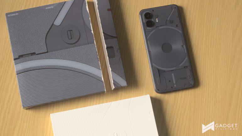
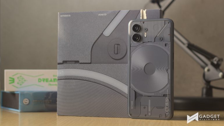
Sadly, the Nothing Phone (2) carries over the pull tab design to open the box which I’m still not a fan of. However, this didn’t come too much of a surprise to me as they did a pull tab as well for the Ear (2).
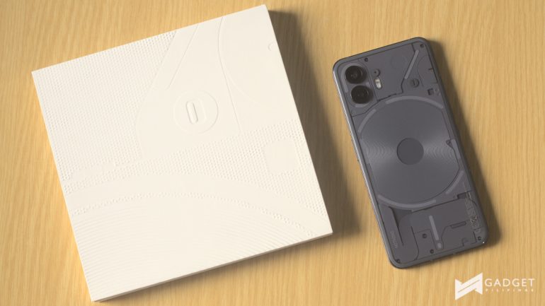
This time around though, I was pleasantly greeted by a little box that houses everything after you take the pull tab off. This inner box makes it easier to store everything and even has its own design that mimics the outer box.
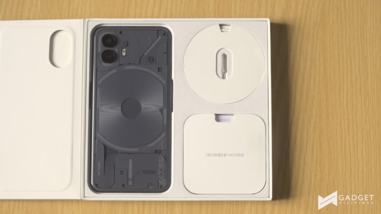
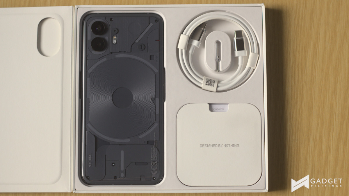
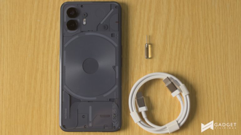
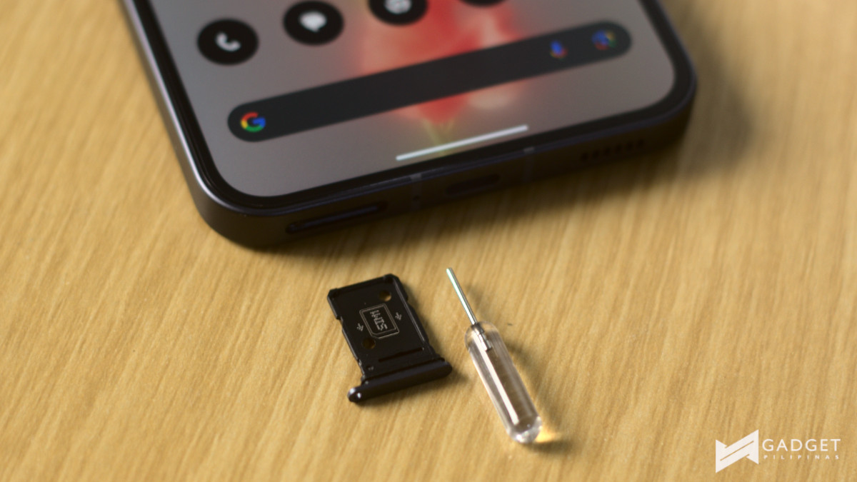
Inside the box are the SIM ejector tool with its transparent handle the charging cable with transparent tips, documentation, and of course, the phone itself.
Before we continue with the review, check out our full unboxing and first impressions of the Nothing Phone (2) below:
Nothing Phone (2) – Build and Design
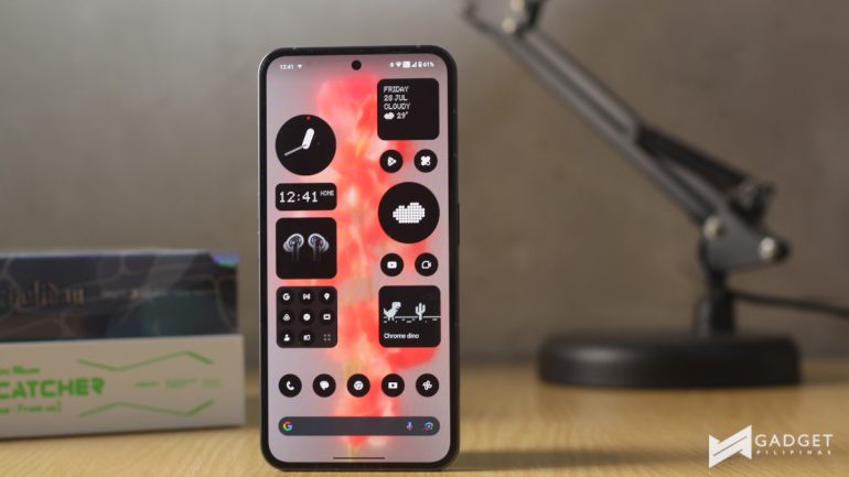
If you’re done with the video, welcome back! Now we get to the review. The Nothing Phone (2) has a larger 6.7-inch display which is roughly the average in 2023 but larger than its predecessor.
This required me to do a bit more hand gymnastics while using the device especially while using it with one hand but I do have average-sized hands. Personally, I didn’t mind the constant adjustments because it also had a more curved back design which made it more comfortable to hold.
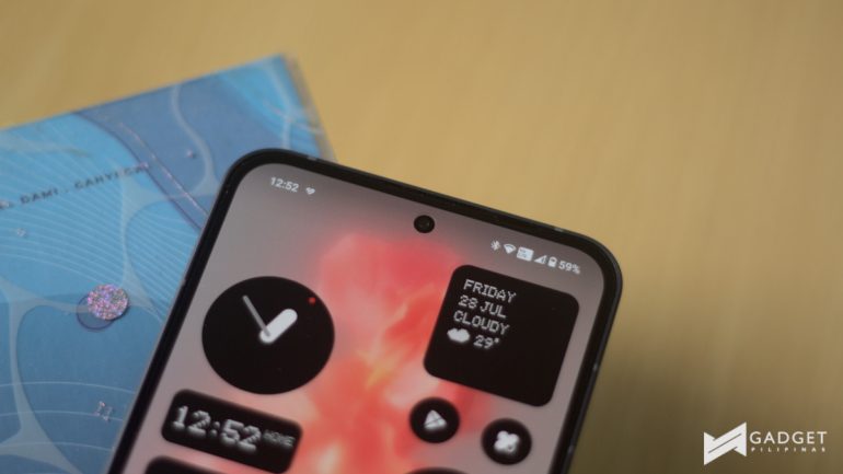
Another change is the front camera that has been shifted to the top center of the LTPO AMOLED panel. This isn’t too drastic but pretty nice for the sake of symmetry. Speaking of the panel, Nothing has once again kept the bezels even on all sides, which again, adds to the balance and symmetry.
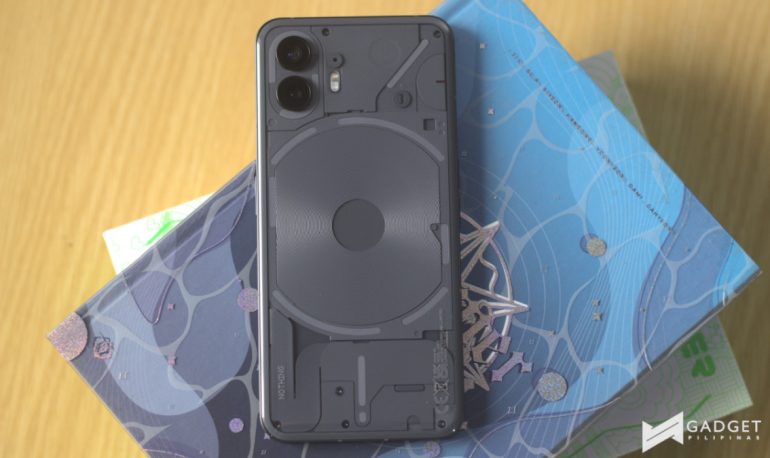
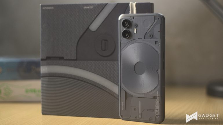
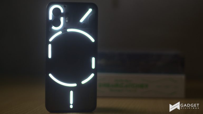
Around the back, you pretty much get the same transparent design but this time the Glyph Interface has been separated into 11 segments from 5 segments or from 12 addressable zones to 3 individually addressable zones. We’ll get to this later in the review but I prefer the segmented design as far as design goes.
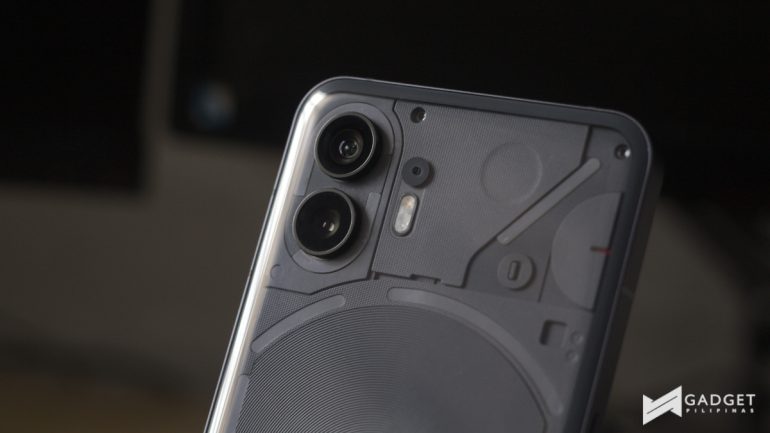
The camera module remains the same with two rear cameras engulfed by the Glyph Interface. The LED flash is slightly larger as well, while the recording light has been shifted in a half circle on the right side.
This time around, Nothing offers White and Gray color options and we were given the Gray variant. While I was quite skeptical about the gray color coming from the black color option last year, I actually now prefer the gray colorway as you see fewer fingerprints than the black colorway.
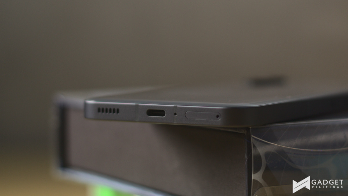
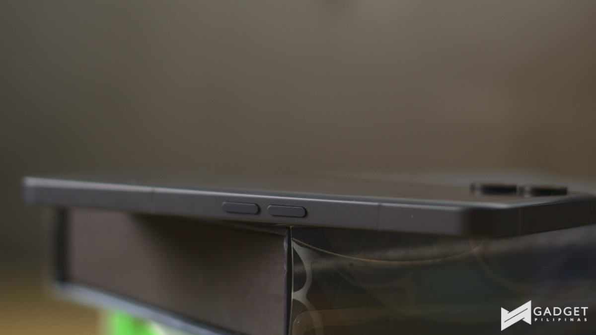
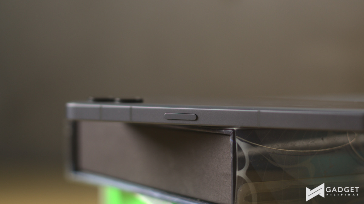
The bottom of the device has the SIM card tray, a microphone, USB-C port, and speaker, from left to right with the display on top. Meanwhile, on the left of the device are the volume rockers, and on the right is the power button.
Nothing Phone (2) – Performance and Hands-on Experience
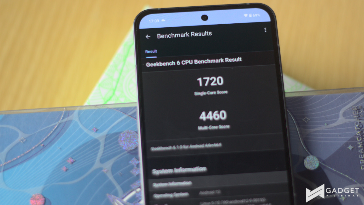
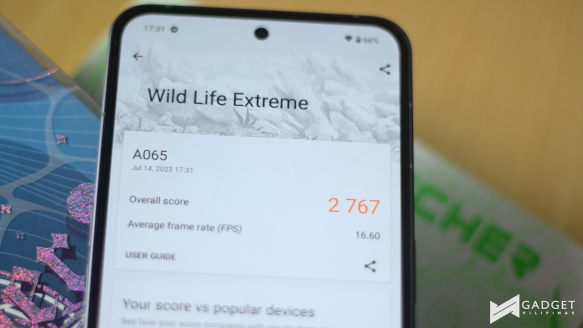
The Phone (2) is equipped with a Snapdragon 8+ Gen 1 chipset, which is a massive leap from the Snapdragon 778G+ used last year. This isn’t quite the Snapdragon 8 Gen 2 that many were hoping for, but it’s still a previous-generation flagship chipset. The cherry on the cake is the lone 12GB RAM offering this time around and either 256/512GB of storage. We were given the 256GB configuration.
As with my other reviews, here’s a peek into the benchmark results, specifically AnTuTu, Geekbench 6, and 3DMark before I get to my experience with the device:
The LTPO AMOLED panel is definitely a game changer here offering three refresh rate modes, Adaptive, High, and Standard. Adaptive goes as low as 1Hz and tops off at 120Hz and I definitely stuck to Adaptive mode and will continue to stick to it. It not only still offers a smooth experience, but it also helps offer a longer battery life while still offering 120Hz at times.
Another benefit of the display upgrade is its brightness. It now goes as high as 1600 nits and 1000 nits outside. The latter is roughly double its predecessor.
The LTPO AMOLED panel of the Nothing Phone (2) also offers better color reproduction when watching videos, which I thoroughly enjoyed. Based on my experience, the stereo speakers sounded a bit more directional which gave a bit more depth.
The audio especially plays a bigger role when playing games, especially with shooters like Farlight 84. I was able to tell where enemies were based on the audio queues without using a headset.
While we’re on the topic of gaming, this is where I really felt like that Snapdragon 8+ Gen 1 really shined. I tested a variety of games including Mobile Legends: Bang Bang, League of Legends: Wild Rift, Diablo Immortal, Honkai Star Rail, and Genshin Impact, to name a few.
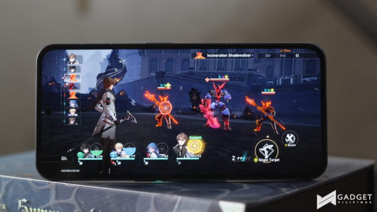
The Nothing Phone (2) blew through Mobile Legends and Wild Rift on max settings with ease. This was pretty much the same with Call of Duty: Mobile and Asphalt 9. As I moved up to Diablo Immortal and Honkai Star Rail, I was still able to crank it up to the max settings albeit had a bit of heat over long gaming sessions.
Where I was most surprised was the raid boss of mobile games, Genshin Impact. I expected to see lags and stutters when I cranked up settings to Highest but I was able to finish up quest after quest on max settings. However, like Diablo Immortal and Honkai Star Rail, it did get warmer but just a bit of discomfort.
Nothing Phone (2) – Camera
On paper, the Nothing Phone (2) seems to carry over the same rear camera module as the company’s first-ever phone, however, the company has upgraded the Sony IMX766 sensor with the Sony IMX890 sensor on the main camera. Meanwhile, the ultrawide lens remains the same Samsung JN1 sensor.
Here are some samples with the main camera:


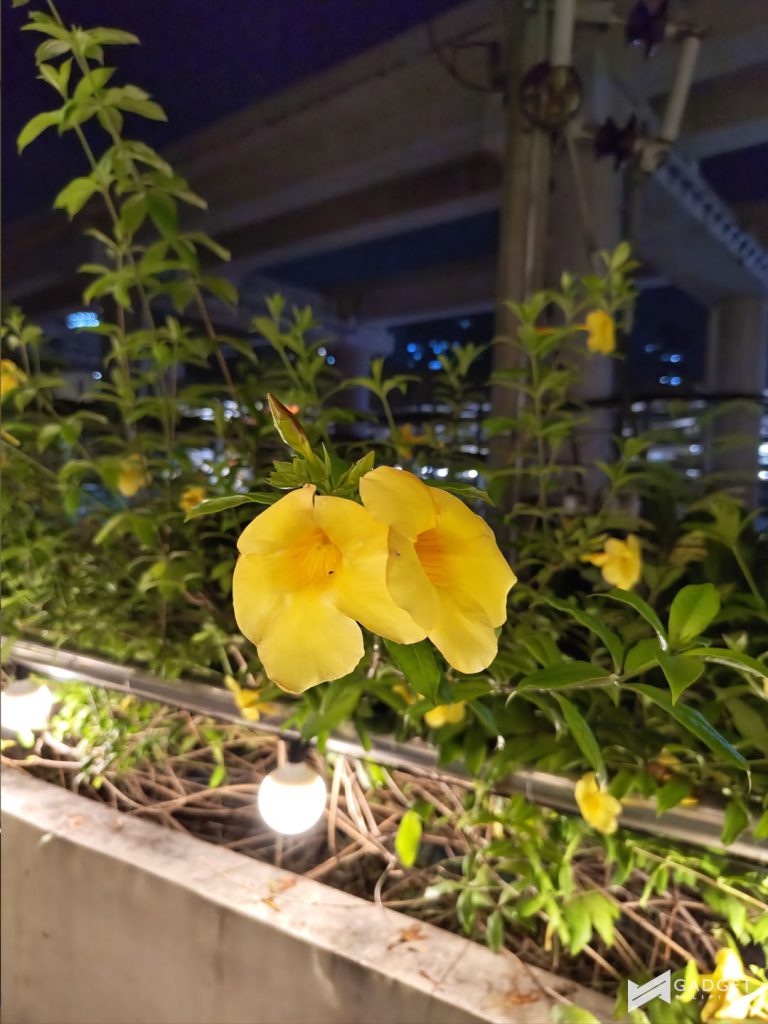
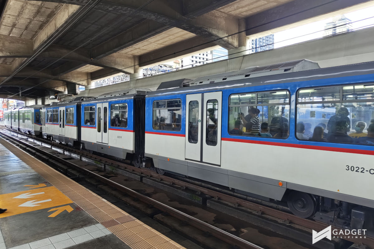
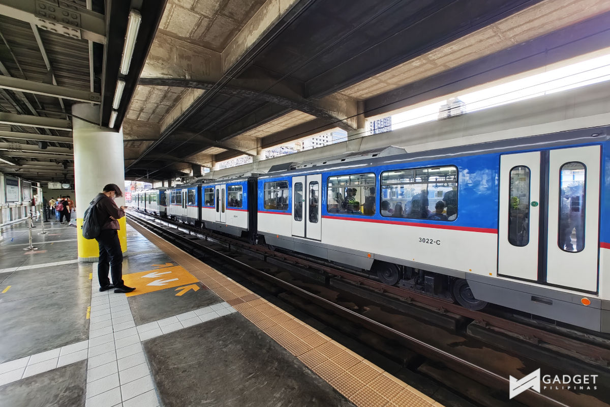
The main sensor offered good color reproduction and delivered impressive dynamic range and details.
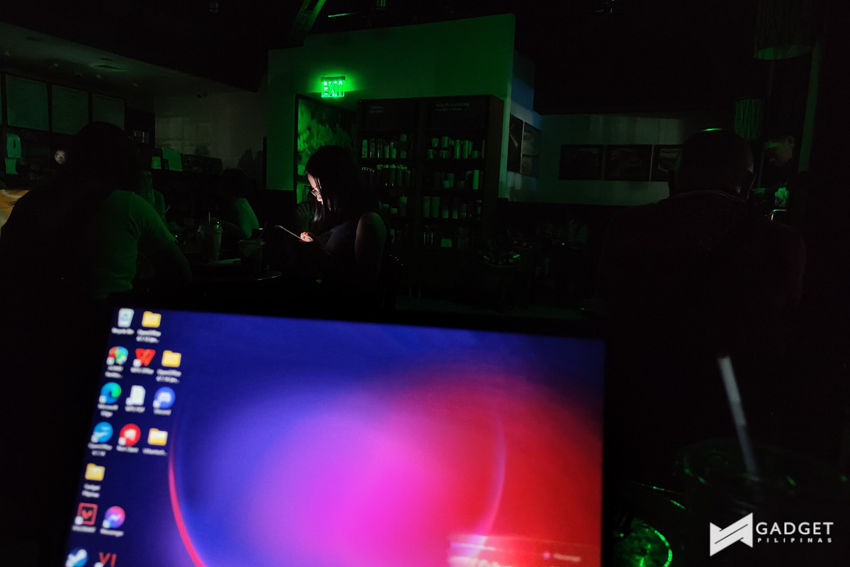
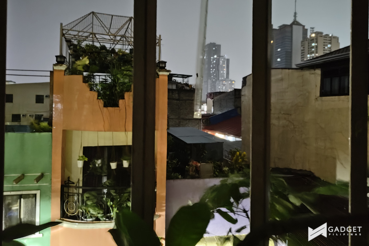
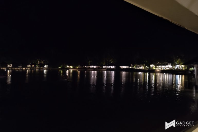
However, in dimmer settings with night mode, you lose the details but still have pretty decent color reproduction.
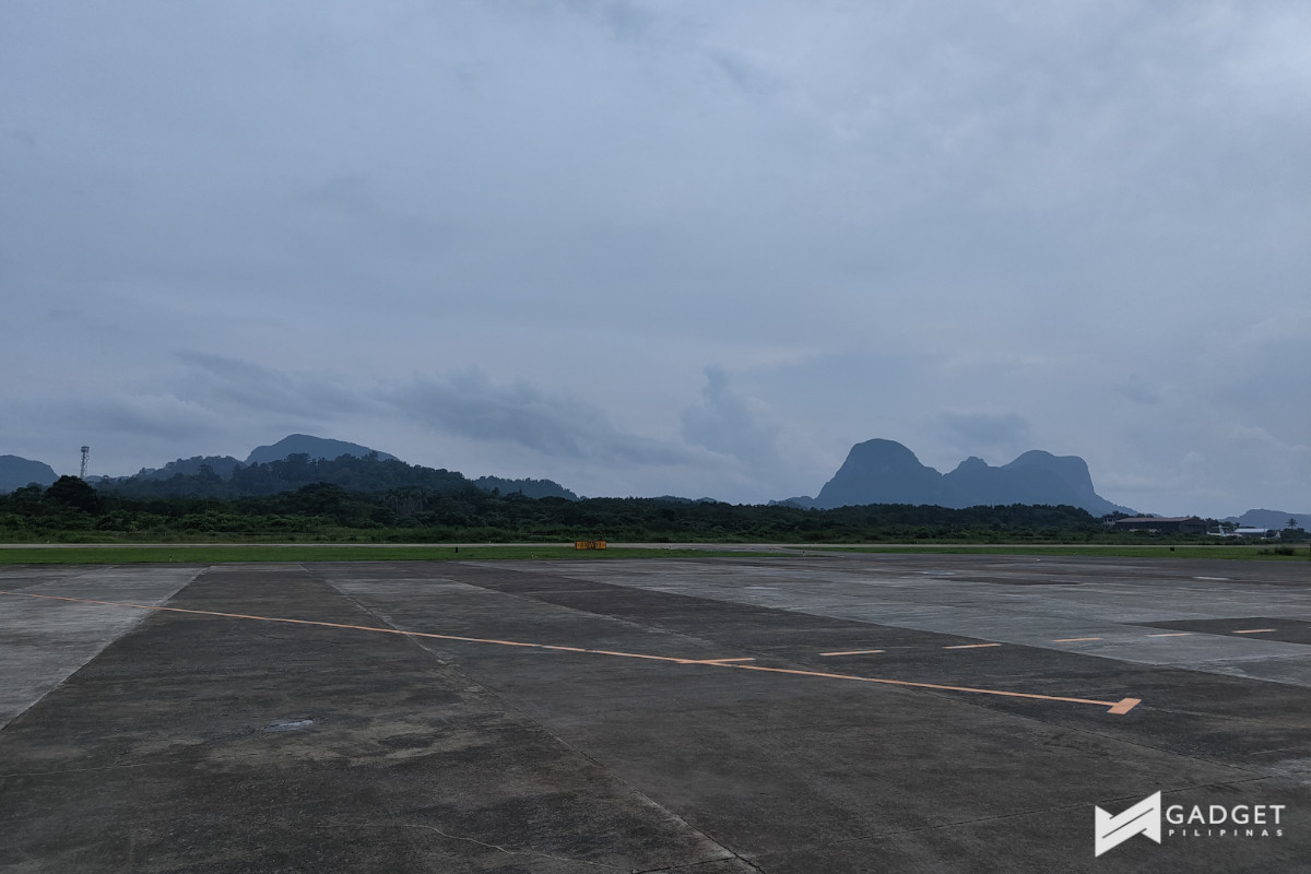
The 50MP ultrawide lens, on the other hand, is able to keep pace with the main sensor. This makes it a very capable snapper.


Meanwhile, on the front, the Nothing Phone (2) has a 32MP Sony IMX615 sensor coming from the 16MP Sony IMX471 sensor.
Like the phone’s rear snappers, the front camera is able to offer impressive photos. The color reproduction is pretty good along with details and dynamic range.


Where it does lack a bit though is its portrait mode. You can adjust the bokeh from 1.0 to 16 but it struggled with separating my wavy hair from the background. The artifacts that you get even as low as 2.8 make the portrait shots look more artificial than most of the other options in the market.


Nothing Phone (2) – Battery
The Nothing Phone (2) has a slightly larger 4700mAh battery than its predecessor but definitely sub-par from the more ‘normal’ 5000mAh batteries in this price range.
That said though, you can tell that the company has worked on improving the battery performance along with the Snapdragon 8+ Gen 1 chipset. It definitely didn’t feel like it had a smaller battery pack.

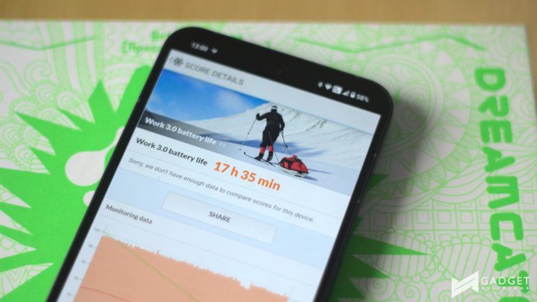
The PCMark battery test alone blew my mind with an average result of 17.3 hours. The Adaptive mode in itself scored 17 hours and 59 minutes, while the High mode (120Hz) clocked in 17 hours and 1 minute. I expected the latter to drop lower but much to my surprise, it stayed within 17 hours.
I did feel the 17 hours of usage with light to medium use of the phone, which is pretty much my normal use. This means a couple of hours of scrolling through social media, checking emails, and many hours of watching videos on TikTok, YouTube, and Netflix.

This, of course, lessened when I played Honkai Star Rail and Genshin Impact but this is also on max settings. You definitely could squeeze more from the seemingly small battery if you lowered graphic settings.
The battery charges at up to 45W fast charging which took about an hour or so which isn’t a big deal, unless you’re on the go a lot. Let’s not forget though that the Nothing Phone (2) also doesn’t come with a 45W fast charger, so it could take longer if you didn’t have a fast charging bring on you.
Nothing Phone (2) – Software
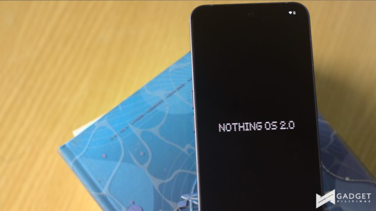
Along with the Nothing Phone (2), the company introduced its second iteration of its UI – Nothing OS 2.0. If you were a fan of Nothing OS previously, the company has taken it up a notch and then some.
Nothing OS 2.0 goes on top of Android 13 and adds its own personal touches while still offering a close-to-stock Android experience.
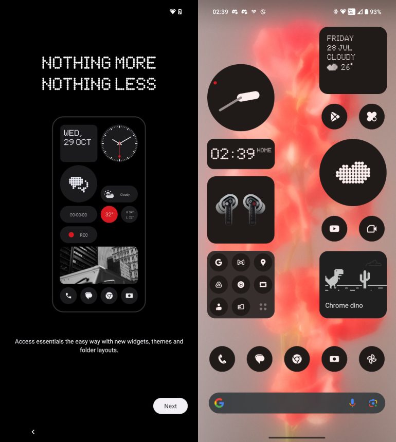
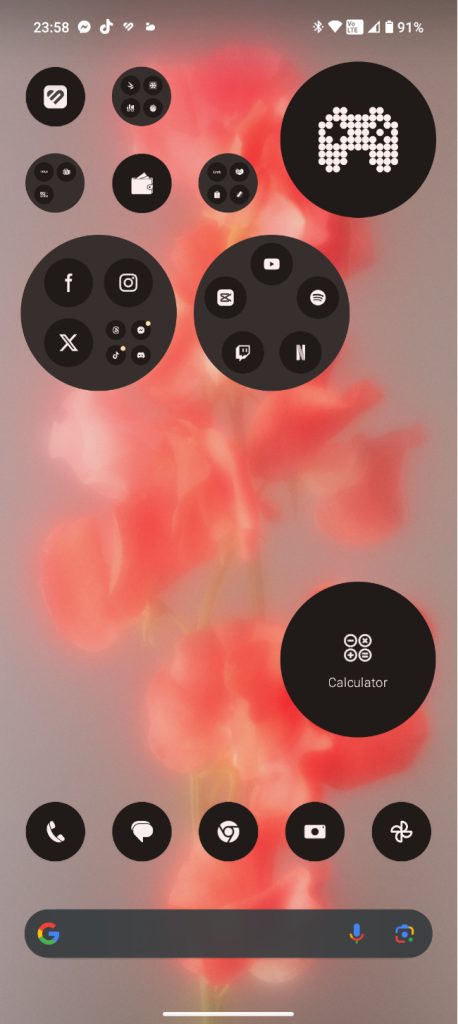
I do adore UIs with close to no bloatware and Nothing retains this with Nothing OS 2.0 on the Nothing Phone (2) while offering more. Among these include more widgets and an icon pack to turn your home screen into a monochrome haven. This may not be for everyone but I definitely appreciate this for a touch of minimalism.
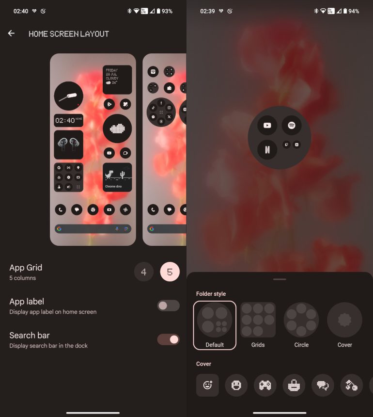
You can also turn and off the labels of your apps on the home screen to add to the minimalist touch of the OS. While we’re on the topic of the home screen, I love the company’s take on folders which you can customize to be larger as well as change the presentation of these. From a square with apps in a row, to a circle with apps in a row or in a circle or even cover the folder altogether with an icon.
Speaking of widgets, the Nothing OS 2.0 now also lets you customize your lock screen with widgets that are made by Nothing, giving you more information like weather and time. These also show up even in the Always on Display for quick updates on these and a bit more customization.
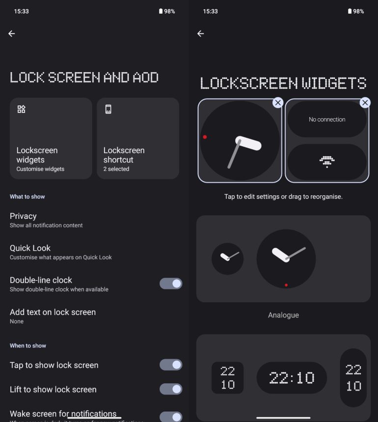
A lot of these are pretty much what Nothing has pre-made for you and this includes the cover for the folder and the widgets. I wish there was a wider variety for these but I’m glad the company has offered an even deeper level of customization with their own touch.
One thing the company has yet to introduce with Nothing OS 2.0 though is a ‘Close all apps’ option when you scroll through your opened apps. Strangely enough, all you get is a screenshot button which I definitely haven’t used, ever. I would definitely prefer the ability to close all the opened apps with one button rather than swipe up on them one at a time.
Nothing Phone (2) – Glyph Interface
The Glyph Interface is definitely one of the two things that makes a Nothing Phone a Nothing Phone, the second, of course, is its transparent design.
With the Glyph Interface on the Nothing Phone (2), it now has more customization to it albeit not as much as I’d hope. It also introduced more ringtones while also retaining features like Flip to Glyph, Charging Metre, Bedtime schedule, and assistant feedback.
However, the new Glyph Interface now also has features like Auto Brightness, Glyph Timer, Glyph Progress, Volume Indicator, and Essential Notifications. Glyph Timer, Volume Indicator, and Essential Notifications are among the most interesting additions albeit also very forgettable.
Essential Notification allows you to set an app that is tied to the upper right light. This will come in handy if you have apps that you can’t miss out on, maybe apps like Gmail or messaging apps in particular. It’s not something I use but a good addition for those who are waiting on something important.
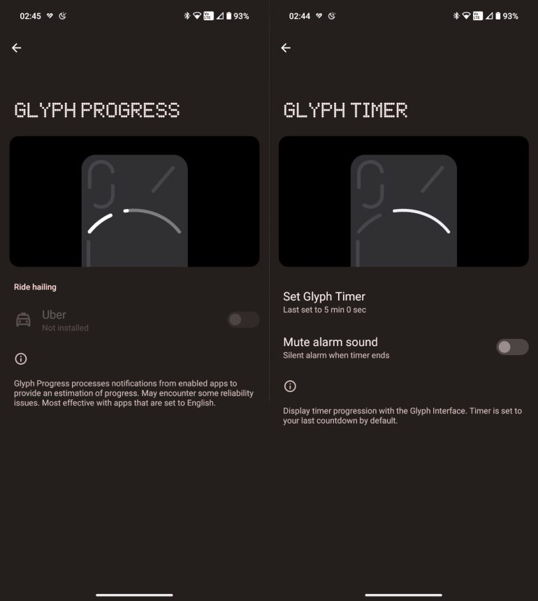
Glyph Timer utilizes the top right strip on the circular module and gives you a visualization of a specific time. Again, something I didn’t use because when I do use a timer, I just ask Google to set it, then I do other things while waiting for it to alarm. However, I can see how it could be used like maybe you want to keep track of your timer but don’t want the loud alarm because you don’t want to disturb people.
Glyph Progress is a pretty good addition but only on paper, the problem though is that it is currently only available with Uber. It basically works like Glyph Timer but shows you how far the driver is through the light strip. If there were more apps that it worked with like Grab or FoodPanda, it could be very useful but pretty much useless for us in the Philippines.
The company also introduced the Glyph Composer which it worked with the Swedish House Mafia. While it is pretty cool to add your own touch to the Glyph Interface through a mix of recording the given audio clips with their respective light section, there aren’t that many sounds to choose from. Like the added features, it’s an interesting addition but could be even better.
We’ll be releasing a comparison article between the Nothing Phone (2) and the Nothing Phone (1), stay tuned for that soon!

Ram found his love and appreciation for writing in 2015 having started in the gaming and esports sphere for GG Network. He would then transition to focus more on the world of tech which has also began his journey into learning more about this world. That said though, he still has the mentality of "as long as it works" for his personal gadgets.